2 June 2010

Idealogical Opinion Project

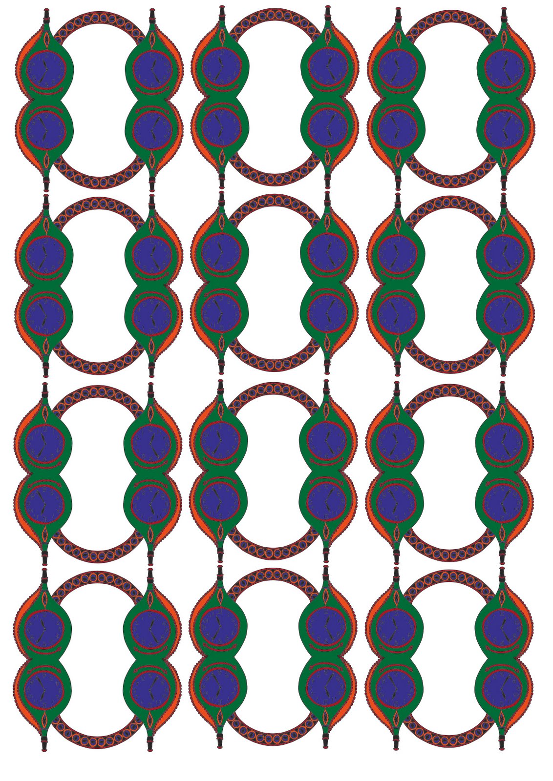
The opposing poster design to my pro consumer poster from the ideological opinion project last year.


I thought it would be interesting to explore the other side of the argument

26 May 2010

Film Titles Project

Film titles opening sequence....

8 May 2010

Films Titles Project

Film poster for my title sequence...


Home Project

I drifted away from the idea of playing cards for a bit - I wanted this project to include text as I had so many memories that couldn't be communicated through image alone. I begun making a notice board like collection of words and pictures.


However I didn't want to drop the idea of playing cards completely. My finished work combines image, text and layouts (such a reflection) commonly seen on cards. Personally I had a lot of fun with this project I enjoyed the challenge of putting emotions, memories etc into a piece of graphic design which others can hopefully see and understand my own connection to this house.

27 April 2010

Home Project

I decided to use my Granny's house for this project, as it's the only house I've known all my life. She is also moving this year so it's a great opportunity to bring together memories of the objects there. The house is called Geufron and is in Wales, it's an old farm house with a barn and about 3 acres of land. As a child I loved being able to explore and run off with my cousins without our parents right behind us. Lots of the objects in the house and the farm have family stories, memories and anecdotes to go along with them. I begun collecting photographs and making sketches of my personal favourite things. I've been playing around with the objects creating patterns etc. From a young age my Granny taught me to play lots of card games so the patterns are inspired by the picture cards from a deck.


Films Titles Project

I've considered changing the name of my film to 'M Is For Martha'


Think I'm going to have an ask around to see which people prefer!

Films Titles Project

Working backwards with this project I came up with the title first. 'Please Cherish Martha' is the name of my film. I then started working on film posters as I thought these would set the tone to the opening sequence. 


My first few designs were very bright and had a circus theme. I really liked the idea of including a carousel, with dead rag dolls, in the opening titles. As I continued to work on the poster design I decided to scrap colour and stick to a black and white design.


19 April 2010

Opening Sequence

Some of my favourites...


Break On Through - Saul Bass
http://www.youtube.com/watch?v=sQH4-f7WiW0&feature=related


Catch Me If You Can
http://www.youtube.com/watch?v=gaLDyrun_Cc


Perfect Man Perfect Woman
http://www.youtube.com/watch?v=UCKQbH0MbKg&feature=related

12 April 2010

Sophie

An Illustration project...


Nine Plus 3


25 March 2010

Some Redesign

I made some slight adjustments to my Complaint Kit packaging. The main changes were to the type layout and fonts.


Using original designs I modified my Small Ads poster design


11 March 2010

Logo Re-Design

This is an interesting piece on the re-design of the Saks Fifth Avenue logo


pentagram.com/en/new/2006/12/new-work-saks-fifth-avenue.php

2 March 2010

12 Book Project

I used blurb.com to publish my book. I'm very pleased with the results.


The Audience Project

My Completed box design...


Inside bits...

21 February 2010

12 Book Project

The Brief:
Compile a list of 12 books that have influenced you and your work. Present these as a piece of Graphic Design. These do not have to all be directly connected to Graphic Design.


I was excited about starting this project as I think books that stay with you after you read them are very special. It was hard to choose 12 specifically but I hope the ones I have picked cover a broad range of subjects and possibly are a representation of part of me.


I initially thought of creating a top twelve chart poster with a magazine style layout. However I changed my mind because I thought this is a perfect opportunity to to make my own book. I want the book to be simple and minimal. I was originally going to use the original artwork of the books I had chosen but instead I have illustrated them myself in order for my own book to be more personal.


Some of my illustrations...


20 February 2010

The Audience Project

My packaging designs so far...


I previously wanted to use a chocolate box shape to put my kit inside. However as I would like it to look like a prescription I'm wondering if it would work better in a drugs box...

16 February 2010

The Audience Project

I have decided to create, for my Daily Mail audience, a complaint letter writing kit. 
Reading the paper I came across several common themes; anti immigration, 'broken Britain', society falling apart and many horror stories often related to a family receiving shocking amounts of YOUR money in benefits. The journalism is highly biased and generally right wing. 


There is a section in the paper for readers to write in. I got the impression that many who do so are severely effected by the papers common themes and are certain they have more intelligence and ideas than the current government - which may be true?


So..... I will enable their complaining by providing the perfect kit. It will include help for letter writing (structure, wording etc), tips for getting a desired response and a dictionary of politically correct words/ terms to avoid getting into trouble.


My kit needs to be packaged in some kind of box. I've researched several options......


I like the idea of the kit being bought as a present in a compact neat box. 


I looked at various gift packaging but the one I like the idea of most was something that was given to me - chocolates. 


I think the type of chocolate boxes pictured on the left would be ideal for what I want.


Because I have decided to work with the shape of a chocolate box and intend the contents to be a gift idea I initially thought that the outer design should reflect this and adopt common chocolate packaging themes such as deep colours: browns and golds and calligraphy script. However because I want it to appeal to people that feel very strongly about particular issues and problems I felt the box should reflect a more serious tone. I began looking at design that has, perhaps, a more practical than visual purpose such as..........


At the moment I'm drawn to prescription medicine boxes. The drugs contained are intended to fix a problem which relates nicely to the ideas behind my complaint letter writing kit!

11 February 2010

The Audience Project

This project is about targeting a particular group of people, aiming to appeal to them by a creative piece of design that meets their desires, interests or attitudes. We have been given a list of groups to chose from including; Polish Roofer, Angry Man, Karaoke Divorcee and many more!


The two that caught my eye were 'Take a Break Receptionist' and 'Daily Mail Fern Britton'. My initial thoughts were to create a receptionist survival kit including essentials for a stereotypical receptionist, such a spare tights, calorie counter, 5-in-1 make up tools. However, for purely research reasons, I picked up a Daily Mail and after being informed of Britain's break down due to knife carrying immigrants, NHS doctors waiting to kill me and the threat of Muslims taking over I decided this wasn't an opportunity to be missed!


So through 'blending irony with information' I hope to create a piece of constructed graphics that has a practical value to the 'Daily Mail Fern Brittons'.

26 January 2010

Quotes Project


17 January 2010

Quotes Project