I am currently working on redesigning my website to give it more of an illustrative appearance.
Initially I had the idea that the homepage of the site would be shelving with various objects n the shelves. Each object would represent a different piece of work or area of the site...

After working on this idea for a while I realised it created the same issues I have with my current design. Once people navigate away from the homepage it can be difficult to navigate other pages without ending up with the standard home, about, work buttons - and this is something I would like to avoid.
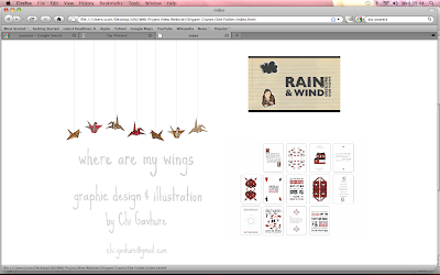
I then moved onto the idea of the website only consisting of one page meaning that all the work and information I feel relevant will be very accessible to visitors. I also think it would be nice to relate the illustration of the site more directly to the site name - where are my wings.
Birds are a representation of wings and working as individually illustrated icons they could each work as a rollover action to bring up various bits of work.
I spent a lot of time trying out different types of birds and whether or not they should be detailed drawing or basic representative shapes.
I then came up with the idea of origami cranes, people often hang the birds to create mobiles etc. Having the cranes 'hang' down from the top of the page means that I can add or remove the birds easily to introduce new bits of work etc to the site. It also means I can keep to the idea of only have one main page. At the moment I am happy with the idea but not sure whether the design is too basic and if a more illustrative appearance is needed. I have also replaced text on the site with hand drawn lettering.

Initially I had the idea that the homepage of the site would be shelving with various objects n the shelves. Each object would represent a different piece of work or area of the site...

After working on this idea for a while I realised it created the same issues I have with my current design. Once people navigate away from the homepage it can be difficult to navigate other pages without ending up with the standard home, about, work buttons - and this is something I would like to avoid.
I then moved onto the idea of the website only consisting of one page meaning that all the work and information I feel relevant will be very accessible to visitors. I also think it would be nice to relate the illustration of the site more directly to the site name - where are my wings.
Birds are a representation of wings and working as individually illustrated icons they could each work as a rollover action to bring up various bits of work.
I spent a lot of time trying out different types of birds and whether or not they should be detailed drawing or basic representative shapes.
I then came up with the idea of origami cranes, people often hang the birds to create mobiles etc. Having the cranes 'hang' down from the top of the page means that I can add or remove the birds easily to introduce new bits of work etc to the site. It also means I can keep to the idea of only have one main page. At the moment I am happy with the idea but not sure whether the design is too basic and if a more illustrative appearance is needed. I have also replaced text on the site with hand drawn lettering.


No comments:
Post a Comment